Case Study
Simplifying content management for admins
ROLE
UX, UI, Research
TOOLS
1.5months
PLATFORM
Web
COMPANY
Thrive
CONTRIBUTION
Led the redesign of Thrive’s Auto curation experience to give admins more control, improve content management and reduce reliance on support teams.


Background
Thrive is an all-in-one LXP designed to transform workplace learning through personalised and scalable content.
The Auto Curation feature allows integration from other content providers—such as LinkedIn Learning, Udemy, and Go1 into the Thrive platform.
As integrations expanded, platform admins struggled with managing the influx of content. It got to the point where support teams had to intervene to bulk remove content that was irelevant to customers platforms. Rather than provide bulk remove functionality, we opted to redesign the autocuration feature to optimise the experience entirely.
This project aimed to:
Streamline content provider workflows
Enhance admin control over content imported in
Reduce the need for support team interference
Who is this impacting?
This project had clear core users that were being impacted. With that already existing, my focus shifted towards deeply understanding how these two groups interacted with the Auto Curation feature.
Platform Admins
Admins curate and manage vast amounts of learning content, ensuring it aligns with their organisation’s needs.
Customer Success Managers (CSMs)
As the bridge between Thrive and its clients, CSMs often would help introduce users to the autocurations functionality.
Support Teams
Regularly updating customer domains upon request for bulk delete.
Research Approach:
Conduct interviews to identify major pain points
Analyse support tickets to validate recurring themes
Map existing workflows to identify inefficiencies
Interviews
I reached out to 4 CSMs, leveraging their direct client relationships to gather meaningful insights. Through user interviews I was able to identify the core pain points they noticed customers were having.
Not Enough Curation Control
Admins couldn’t narrow their provider searches, leading to too much content being pulled in.
Unable to rename jobs pulled through.
Effort-Intensive Management
Admins had to delete unwanted content manually or raise support tickets.
Large logs made reviewing and managing content time-consuming.
Multiple jobs took a lot of time
Job Behaviour Limitations
Jobs kept pulling new content through unless manually deactivated afterwards.
Once a job was created, admins couldn’t edit settings like tags, filters, or audiences, forcing them to start over.
Difficult to Find the Right Content
Admins struggled to find the specific content they needed.
They didn’t know which provider had the content they were looking for.
Analyse Support Tickets
Reviewing with the support team, the average amount of content being removed from customer domains averaged between 1500-2000 for larger content providers, with instances up to 5,000. This was a real problem for two reasons:
Customer Facing
Client platforms were being flooded with content, making it harder to find the right things.
Thrive Facing
Excess time is wasted on support fixing these scenarios when it could be used elsewhere.
Averaged 3 cases per month
HMW help admins manage content imports efficiently to prevent overload and reduce manual clean-up?
HMW enhance content search and discovery so admins can quickly find relevant content and providers?
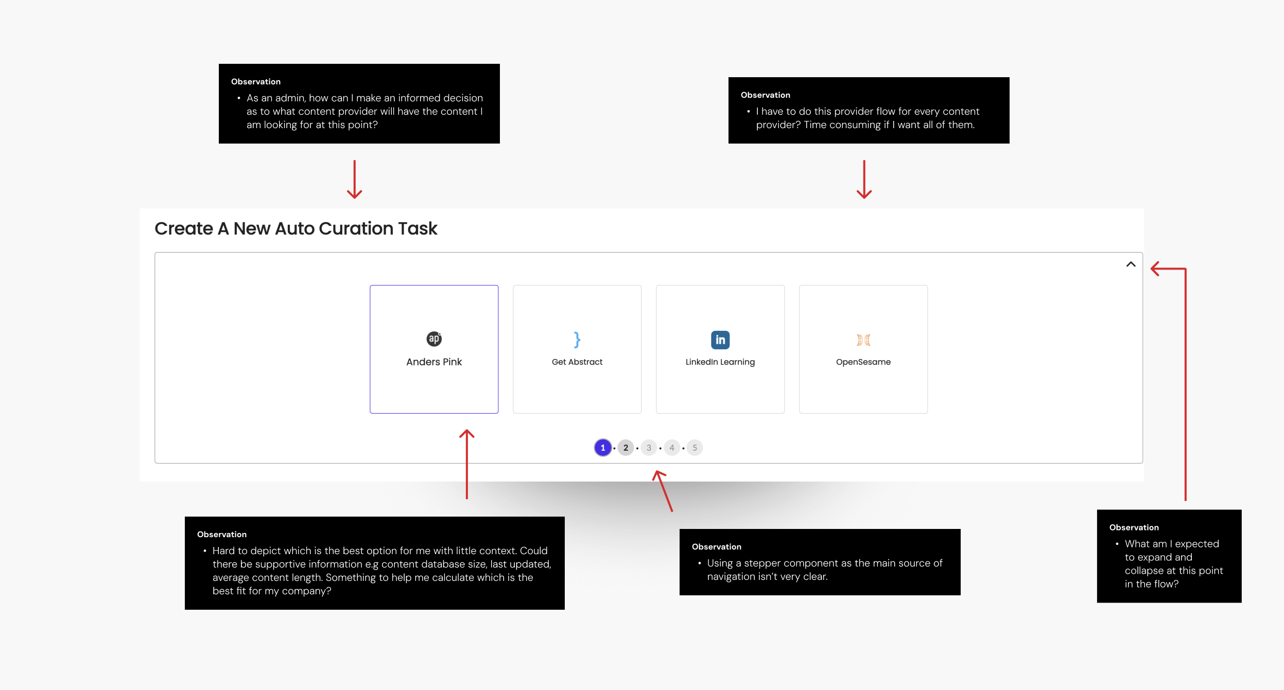


How might a merged experience look?
I transitioned from insights to design exploration. Starting with cross-functional (design, product and tech) brainstorming sessions, we explored various approaches to content filtering, job management and creation. Each idea was evaluated to ensure alignment with user needs and technical feasibility. The problems at this stage had been distilled down enough to key problem areas we wanted to explore with basic wireframes:
Every GCSE student knows the pressure of exam season—the endless notes, the last-minute cramming, the uncertainty of whether anything is actually sinking in. But how do they really revise? And more importantly, what makes it work (or not work) for them?
To find out. I ran user testing sessions with 20 students. digging into their revision habits, struggles, and what they wished was different. Here are some of the key insights:
Understanding how students learn
A one-flow autocurations flow to minimise the need for multiple jobs
Distinguished flows between a manual job and a live job that constantly pulls through content that meets the criteria
Here’s what we set out to design
User Testing
I conducted a series of moderated sessions again with CSM’s, this time to get feedback on a prototyped flow, introducing a merged provider flow and also testing the addition of a one-time alongside a continuous content flow. During these sessions, they were presented with prototypes for the following
Redesigned dashboard and curation entry points
Split flows for one-time job and continuous job flows
One flow for all providers
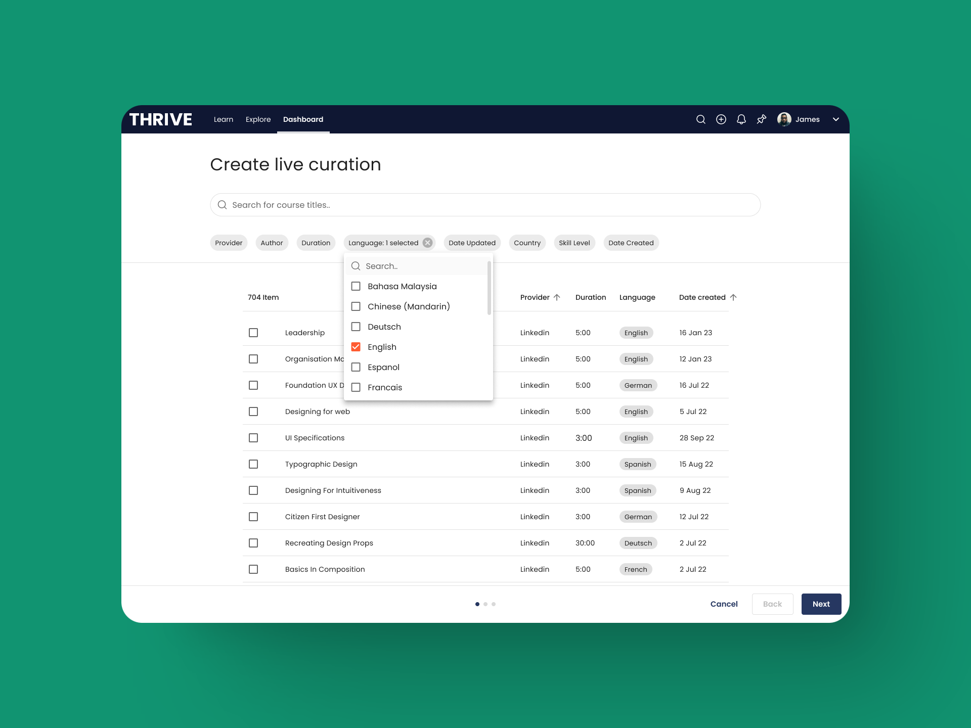
Improved filters


4 of 4 users intuitively completed the task of filtering content by multiple criteria without issue.
4 of 4 easily grasped the distinction between manual and live curation, with both flows well understood.
4 of 4 found the flow intuitive and would benefit customers.
4 of 4 believe this was a big improvement to the existing functionality.
4 of 4 were able to edit an existing job and make changes.
2 of 4 users struggled to figure out where to preview manual content
Explore how to make the preview modal more intuitive.
Outcomes
Higher job completion
Job completion rates rose from 62% to 82%, reducing abandoned setups.
Adoption
Average providers per job increased from 1 to 2, reducing the need for multiple setups.
Fewer jobs needed
Total jobs created per admin dropped by 36%, streamlining workflows.
Lower support demand:
Content curation-related support tickets decreased by 80%, indicating improved usability.