
Streamlining pathways through user feedback
Case study
ROLE
UX, UI, Research
DURATION
1 month
PLATFORM
Web
COMPANY
Thrive
Led the redesign of Thrive’s ‘Pathways’ experience to improve learner flow and engagement.
CONTRIBUTION
KEY METRIC
+12% Pathway Completion Rate

Background
Thrive is an all-in-one LXP designed to transform workplace learning through personalised and scalable content. Often used for onboarding, compliance, or career progression, Pathways is a feature in Thrive that guide users through curated content to support learning goals.
Despite being one of the most used features, Pathways consistently drew high volumes of negative feedback. This disconnect between high usage and poor satisfaction signaled a clear business and user opportunity to improve the learner experience.
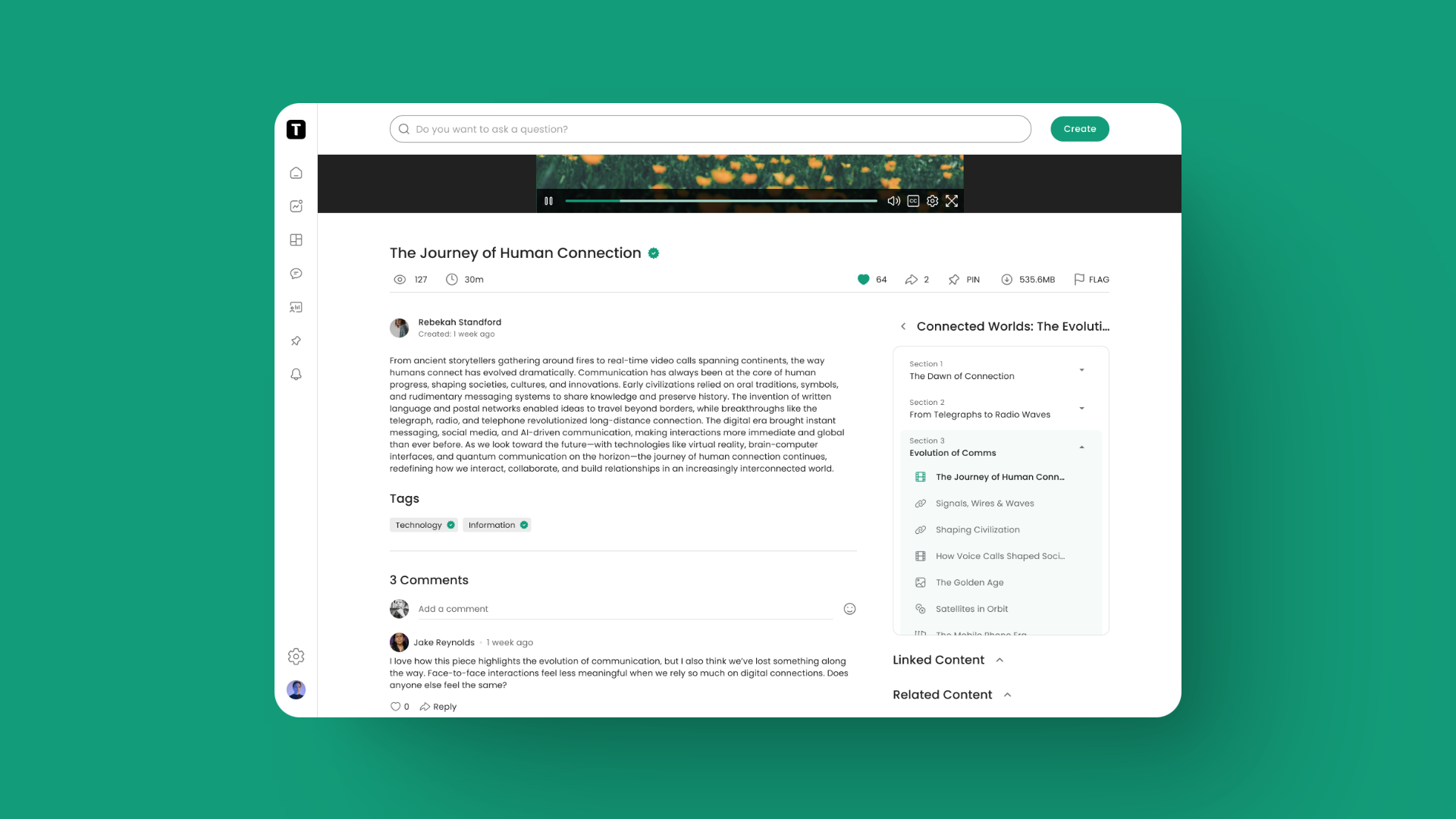
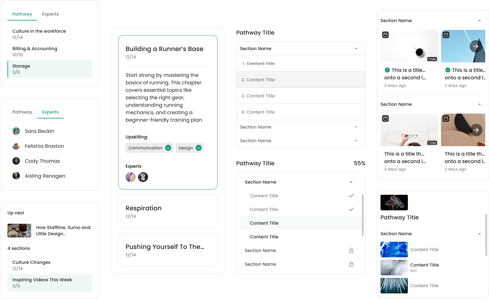
Before: Pathway Overview Screen

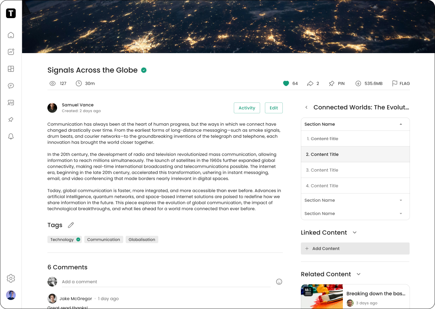
Before: Pathway Content Screen
Discovering the problems
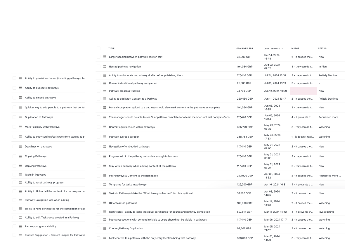
Using Planhat, our feedback-gathering tool, I triaged user requests and identified 56 specific issues related to Pathways and began to group feedback into underlying themes. We prioritised the issues that surfaced most frequently—treating these as signals of recurring pain points across our user base.
Working with PM and Engineering in a Three Amigos session, we collaboratively descoped items that weren’t technically feasible within our one-month sprint timeline, allowing us to stay focused while still delivering meaningful impact.
What we heard
Users often felt confused, unsure of where they were in a pathway or how much progress they made
Users struggled to see the structure of the pathway ahead with no clear expectations as to what was upcoming
Users often got distracted by secondary elements that lead them away from their pathway objectives
What we want to explore
Enhance navigation and progress cues to help learners stay oriented throughout their journey
Streamlining the UI to reduce friction points and improve focus
Clarifying the pathways structure to give learners a stronger sense of direction and intent
What does our data tell us?
Users frequently loop back to the overview page
Clickstream patterns show that users regularly return back to the overview page instead of progressing to the next piece of content in the pathway.
Users often click into secondary content over pathway content
Clickstream patterns show a strong affordance towards users clicking related content as their next steps and not the pathway content.
Users frequently try to interact with locked pathway sections
Heatmaps showed that learners were often clicking into pathway content that was locked. This implied a desire to see the landscape of the learning and a desire to preview.
UX Evaluation
I conduct a UX evaluation to assess the existing UI and UX. I compare customer-reported pain points with my own findings to validate assumptions and identify additional areas for improvement, including potential quality-of-life enhancements.
Given the findings, how might we improve the pathway experience?
1) Help learners pick up where they last left off
2) Help users see the full landscape of their learning journey better within content
3) Provide clearer progress cues so learners always know where they are and what they have done
4) Explore the potential of previewing locked content, giving users visibility into upcoming content
5) Explore making related content less prominent
Key opportunities to address
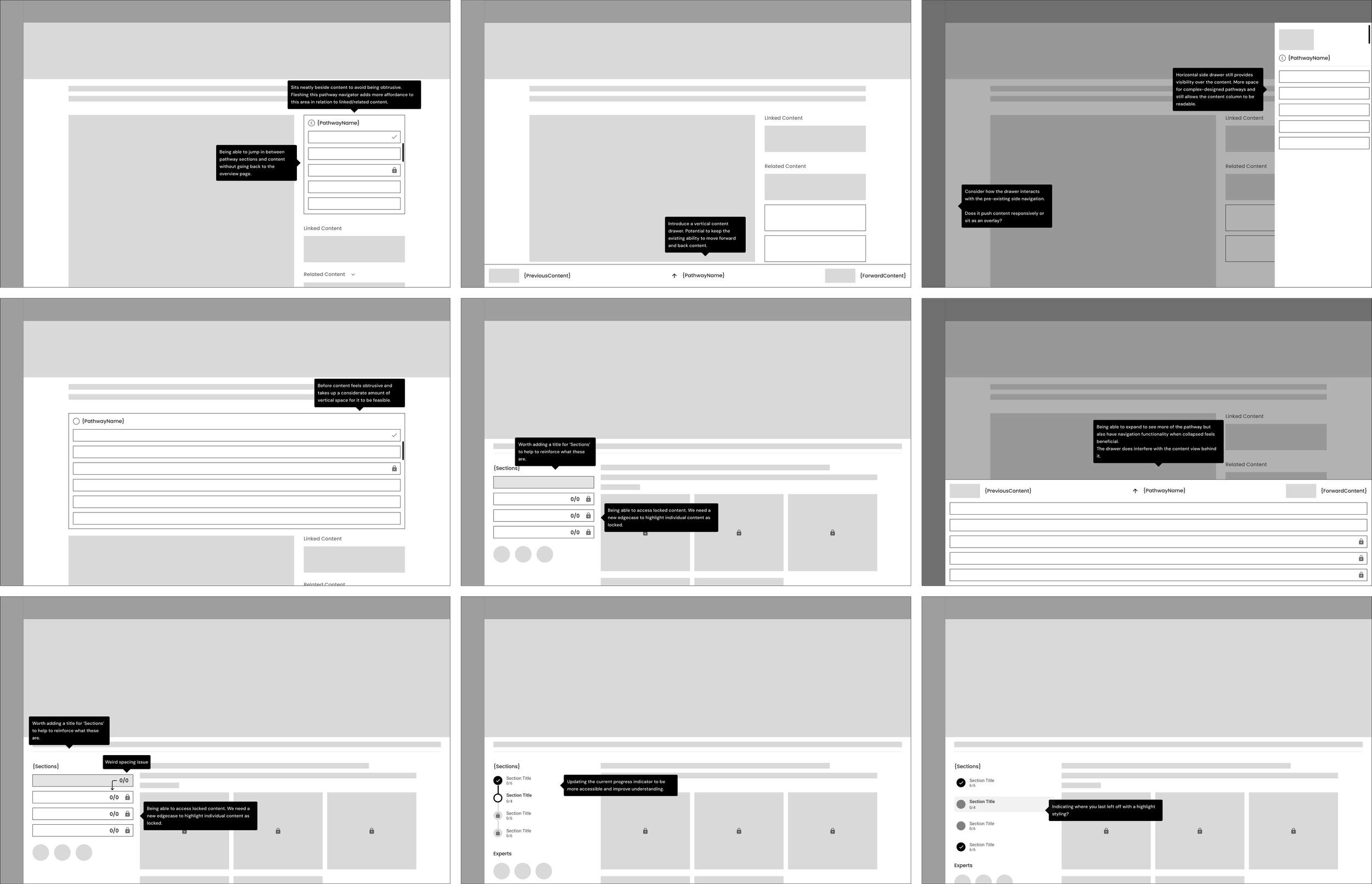
Early wireframes focused on improving the pathway content layout, serving as the foundation for future design decisions.

I explored inspiration that aligned with my wireframes, identifying well-established patterns that could enhance the project.
Using new inspiration, I refined the designs into higher fidelity concepts, scheduling sessions with developers to discuss feasibility at this point.

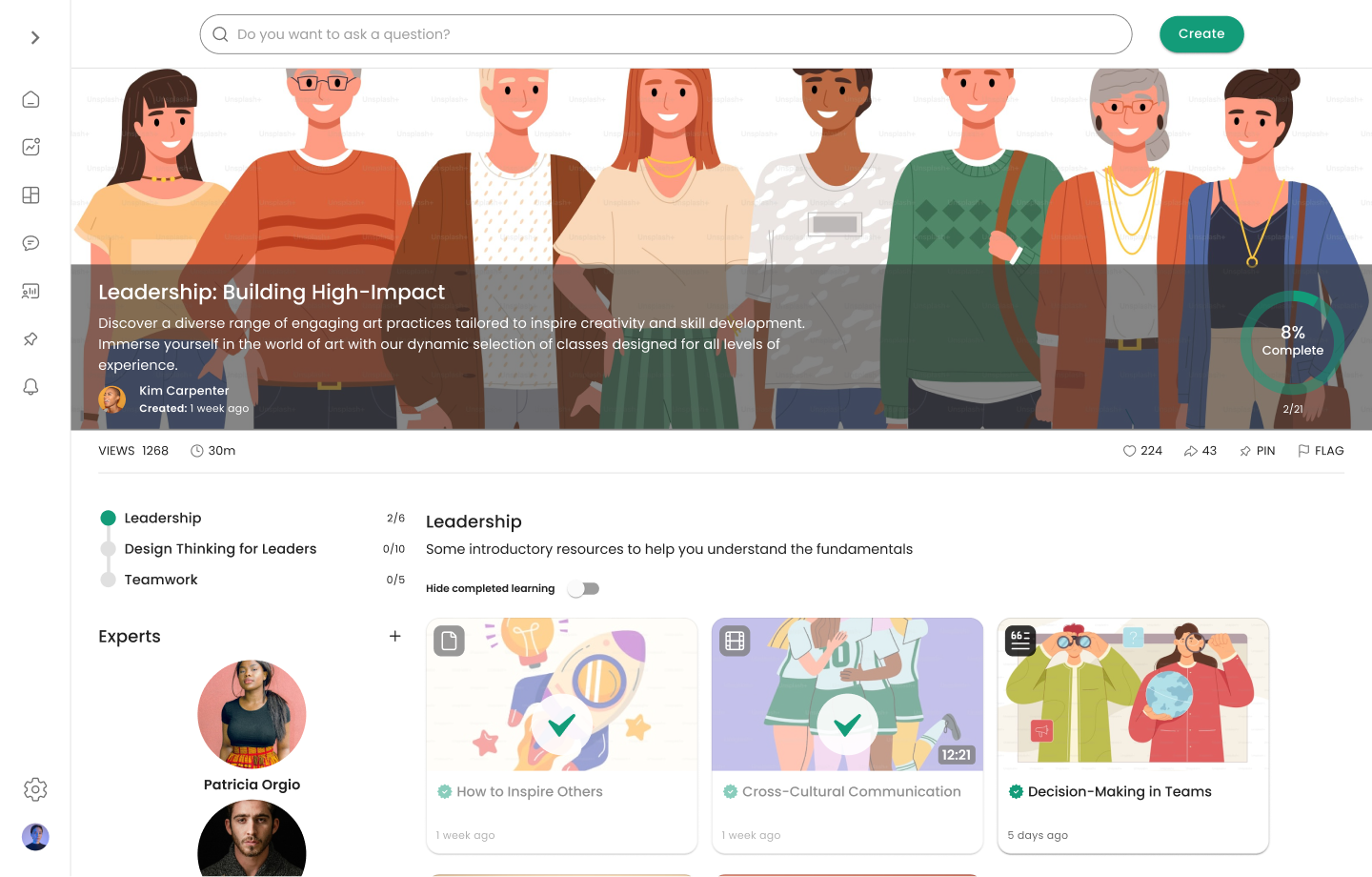
High-fidelity component exploration

High-fidelity component exploration
High-fidelity component exploration

High-fidelity component exploration
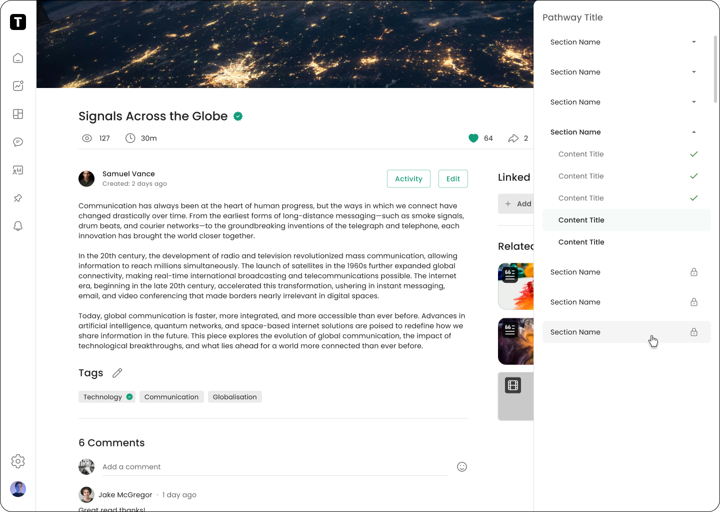
High-fidelity component exploration

High-fidelity component exploration
User Testing
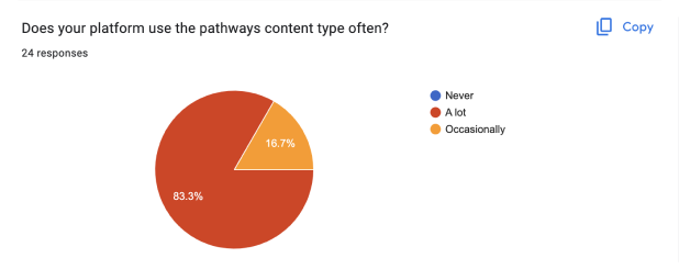
We took some high-fidelity mockup designs to our Innovation Panel for feedback on potential solutions for pathways.
All respondents found the concepts helpful in improving the pathway experience.
Most respondents find the Pathway Navigator clear, useful and would have a strong impact on their platforms.
Most respondents disagreed with removing Linked/Related Content from pathways, however agreed they should be less prominent.
All respondents liked being able to view locked sections.
Key Insights

Key Insights

Key Insights

Key Insights

Key Insights

Key Insights
Design Iteration

Designs tested and iterated. It was time to prepare designs for handover, mapping out edgecases, flows and component logic for a smooth developer experience.

Several stages of design QA, providing feedback to ensure Figma parity.
Pathway enhancements on a staging site. Few adjustments still to be made at this stage before release.
Outcomes
44% +12%
increase in pathway completions
28% -30%
of users clicking Related/Linked Content instead of Next
32%
of users engaging with locked content previews
54% +15%
of returning users continuing from their last-seen content
3 +1
Average number of pathway lessons completed per session